redline-js


Design review, directly on your site.
redline-js adds an inspection layer to any website — designers click any element to see its exact properties (font, color, spacing) and suggest edits. Changes are exported as structured JSON, ready for developer handoff.
No more back-and-forth. No more screenshots with arrows.
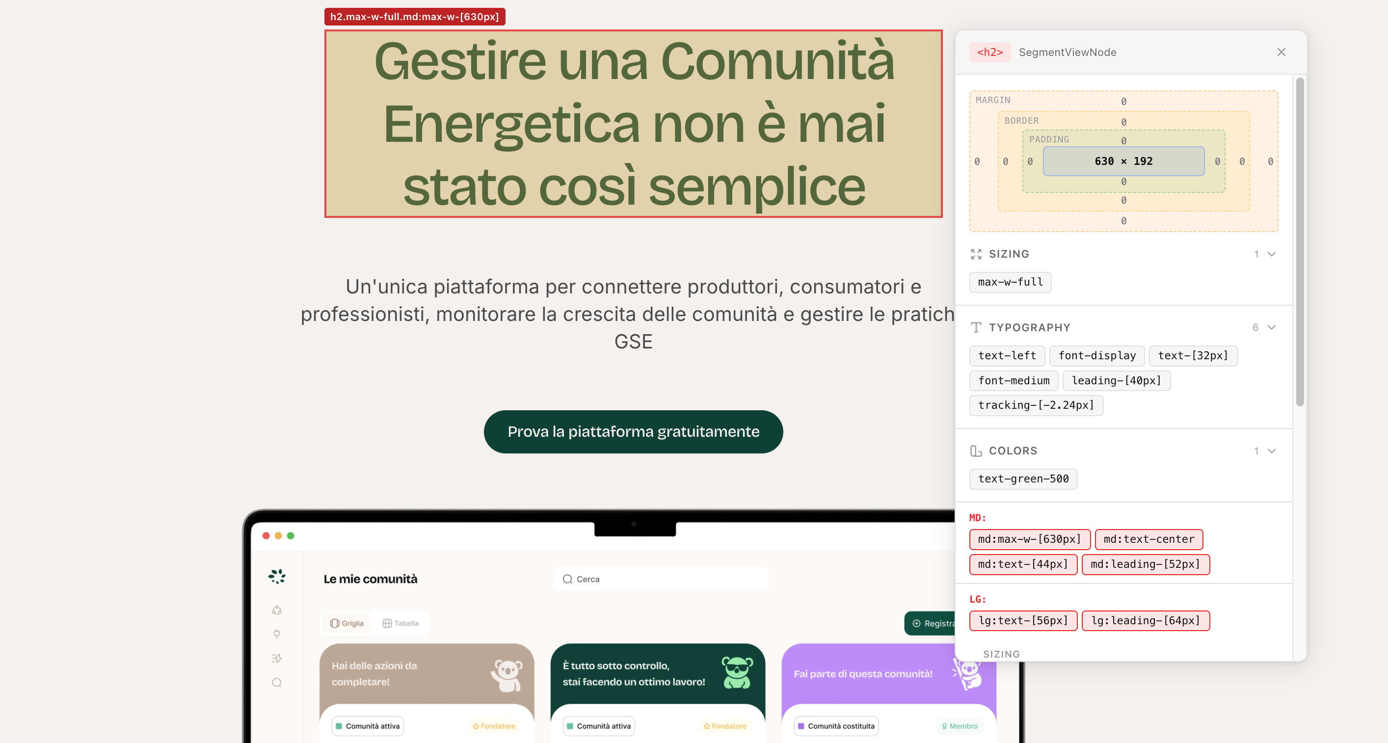
- Figma-style typography panel — font, weight, size, line height, tracking, alignment, color
- Smart font detection — auto-detects loaded fonts from CSS custom properties and
document.fonts - Design system aware — optional token matching (colors, typography presets, font families)
- Tailwind inspector — classes grouped by category, responsive variants, CSS mappings
- Box model diagram — visual margin, border, padding, content
- Live editing — click any value to change it, changes apply instantly
- Persistent changes — localStorage with build hash invalidation
- JSON export — structured file ready for developer handoff
- Framework agnostic — vanilla JS core + React adapter
- Zero config — works out of the box, design system config is optional
npm install redline-js<script type="module">
import { createDesignReview } from 'redline-js';
createDesignReview({
enabled: true,
buildHash: 'my-build-123',
});
</script>import { DesignReviewProvider } from 'redline-js/react';
export default function Layout({ children }) {
return (
<>
{children}
<DesignReviewProvider config={{
enabled: process.env.NEXT_PUBLIC_DESIGN_REVIEW === 'true',
buildHash: process.env.NEXT_PUBLIC_BUILD_HASH,
}} />
</>
);
}Then start with:
NEXT_PUBLIC_DESIGN_REVIEW=true npm run dev- A red R button appears in the corner of the page
- Click it to activate inspection mode
- Hover over any element to see its box model overlay
- Click to open the inspection panel:
- Typography summary — Figma-style: font, weight (SemiBold not 600), size, line height, tracking as %, color with token name
- Tailwind classes grouped by category (typography, colors, spacing, etc.)
- Responsive variants (sm, md, lg) highlighted separately
- CSS mappings — see what each Tailwind class resolves to
- Box model diagram — margin, border, padding, content
- Click any value to edit it live — changes apply instantly
- Changes persist in localStorage across page refreshes
- Export as JSON — structured file ready for developer handoff
Optionally pass your design system tokens for richer inspection:
<DesignReviewProvider config={{
  enabled: true,
  designSystem: {
    fonts: [
      { family: 'Bricolage Grotesque', weights: [400, 500, 600, 700] },
      { family: 'Inter', weights: [400, 500, 600] },
    ],
    colors: {
      'green-500': '#0B493D',
      'mint-500': '#A1EDB1',
      'neutral-900': '#111111',
    },
    typography: [
      {
        name: 'Desktop/H1',
        fontFamily: 'Bricolage Grotesque',
        fontWeight: 600,
        fontSize: '64px',
        lineHeight: '72px',
        letterSpacing: '-4%',
      },
    ],
  },
}} />
When configured:
- Font select shows your design system fonts (otherwise auto-detected from the page)
- Weight select shows only weights available for the selected font
- Color shows the token name alongside the hex value (e.g.,
#0B493D green-500) - Typography preset badge appears when values match a named style (e.g.,
Desktop/H1)
Prevents stale edits from being re-applied after code changes:
// next.config.ts
const nextConfig = {
  env: {
    NEXT_PUBLIC_BUILD_HASH: `${Date.now()}-${Math.random().toString(36).slice(2)}`,
  },
};
Designer makes edits, developer applies fixes, new build hash, old edits are automatically cleared.
| Option | Type | Default | Description |
|---|---|---|---|
enabled |
boolean |
false |
Show the widget |
buildHash |
string |
'dev' |
Change per deploy to invalidate saved edits |
position |
'top-left' | 'top-right' | 'bottom-left' | 'bottom-right' |
'bottom-right' |
Widget position |
theme |
'light' | 'dark' |
'light' |
Panel theme |
panelWidth |
number |
360 |
Panel width in px |
zIndex |
number |
999999 |
Widget z-index |
storageKey |
string |
'__redline-changes__' |
localStorage key |
tailwindVersion |
3 | 4 | 'auto' |
'auto' |
Tailwind version detection |
exclude |
string[] |
[] |
CSS selectors to skip |
designSystem |
DesignSystemConfig |
— | Design system tokens (fonts, colors, typography presets) |
onExport |
(data) => void |
— | Custom export handler |
const rl = createDesignReview(config);

rl.activate();       // Start inspection mode
rl.deactivate();     // Stop inspection mode
rl.toggle();         // Toggle on/off
rl.isActive();       // Check state
rl.getChanges();     // Get tracked changes
rl.exportChanges();  // Get export payload
rl.clearChanges();   // Clear all + rollback
rl.destroy(); // Full cleanupimport { useDesignReview } from 'redline-js/react';
function DesignToolbar() {
const { isActive, toggle, changes, exportChanges, clearChanges } = useDesignReview();
return (
<button onClick={toggle}>
{isActive ? 'Stop' : 'Inspect'} ({changes.length} changes)
</button>
);
}{
"changes": [{
"selector": "div > h2:nth-of-type(1)",
"componentHint": "HeroTitle",
"breakpoint": "base",
"page": "/piattaforma",
"modifications": [{
"property": "font-size",
"originalValue": "32px",
"newValue": "28px"
}],
"timestamp": "2026-03-23T21:16:00Z"
}],
"metadata": {
"exportedAt": "2026-03-23T21:20:00Z",
"totalChanges": 1,
"pages": ["/piattaforma"],
"toolVersion": "0.1.0"
}
}| Key | Action |
|---|---|
Esc |
Deselect element or deactivate |
| Click same element | Deselect |
MIT