Repository navigation
[DataGrid] Export ToolbarRoot - #23322
Conversation


Allows reusing the toolbar styles outside of the toolbar, for example in the
header of a drawer displayed alongside the Data Grid.

Closes mui#23314
The toolbar styles referenced the Data Grid CSS variables directly, which are
only defined on the Data Grid root element. Rendered anywhere else, ToolbarRoot
lost its padding, gap and bottom border.

Declare those references with a fallback resolved from the theme, so the
component can be used standalone while still preferring the variables when they
are defined.

Replaces the drawer demo with a simpler one that no longer needs
GridPortalWrapper.
 JCQuintas
added
type: enhancement

Deploy previewBundle size
Check out the code infra dashboard for more information about this PR. |

 michelengelen
left a comment
michelengelen
left a comment
There was a problem hiding this comment.
LGTM in general ... just a comment on the docs wording
| The Toolbar is the top level component that provides context to child components. | ||
| It renders a styled `<div />` element. | ||
|
|
||
| The styled element is also exported on its own as `ToolbarRoot`. See [Reusing the toolbar styles](#reusing-the-toolbar-styles). |
There was a problem hiding this comment.
do we really need to link a section thats just 4 lines below? :D
| ``` | ||
|
|
||
| It can be rendered anywhere, including outside of a Data Grid, and picks up the theme values the Data Grid uses. | ||
| It doesn't provide the toolbar context, so [Toolbar Button](#toolbar-button) and the other toolbar subcomponents can't be used inside it. |
There was a problem hiding this comment.
Maybe provide the happy path here (injecting the context - do we even have a useToolbarContext function?) as well?
There was a problem hiding this comment.
WDYM? How to use it inside the grid provider? 🤔
There was a problem hiding this comment.
We do have both, in @mui/x-internals/ToolbarContext: useToolbarContext and ToolbarContextProvider. Neither is exported from @mui/x-data-grid.
Exporting the provider wouldn't be enough though, because the missing context is only half the reason. ToolbarButton also needs the grid itself:
// ToolbarButton.tsx
const rootProps = useGridRootProps();                 // throws outside a Data Grid
useRegisterToolbarButton(props, buttonRef);           // toolbar context
useComponentRenderer(rootProps.slots.baseIconButton, ...)
It renders the baseIconButton slot, which comes from the grid root props, and useGridRootProps throws unconditionally outside a Data Grid. So even with the context injected, the subcomponents still can't render there. <Toolbar /> has the same constraint, for the same reason.
Which means the happy path already exists and it's <Toolbar /> inside a Data Grid, the snippet in Anatomy just above. ToolbarRoot is only the styles-only escape hatch for elements that aren't a toolbar.
I reworded it to say that instead of only stating what doesn't work:
It only applies the styles.
The toolbar subcomponents such as Toolbar Button render Data Grid slots and register with the toolbar context, so they need a Toolbar inside a Data Grid.
I left the context provider unexported: on its own it would be misleading, and inside a grid it adds nothing over <Toolbar />. Happy to revisit if you'd rather expose it.

 noraleonte
left a comment
noraleonte
left a comment
There was a problem hiding this comment.
Nice addition 🎉
A few notes:
- Should the standalone toolbar have the
MuiDataGrid-toolbarclass? 🤔 - Typography and bg color don't match the grid. (Text inside the
<Typography/>comp does, but anything outside material components breaks)
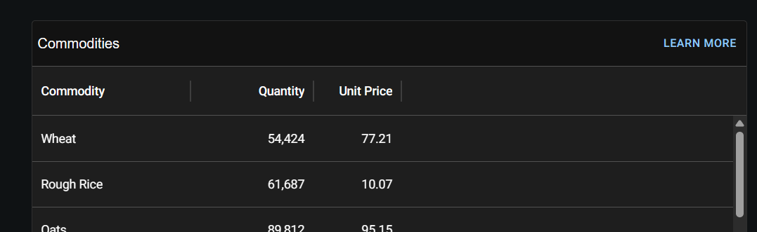
…oot`

The toolbar inherited `font`, `color` and `background-color` from the Data Grid
root, so a standalone `ToolbarRoot` fell back to whatever the surrounding page
used. Content wrapped in a Material component looked right, raw text did not.

Declare the three properties from the same CSS variables the root uses, with a
theme fallback, like the spacing and border already do.

Also drop the link to a section that sits a few lines below it.

This is added by the |
The title used `paddingLeft: 1`, which overshot the column header text by 4px.
Follow the same convention as the built-in toolbar demo instead: `flex: 1` with
`mx: 0.5`, which lines the title up with the first column and lets the demo drop
its `justifyContent` override on `ToolbarRoot`.
The missing toolbar context was only half the reason the subcomponents cannot be
used inside `ToolbarRoot`: they also render Data Grid slots through
`useGridRootProps`, which throws outside a Data Grid. Say that, and point at
`<Toolbar />` instead of only stating what does not work.


Closes #23314
ToolbarRoot, the styled<div />rendered by<Toolbar />, was module-private, so there was no way to reuse the toolbar styles elsewhere without copy-pasting them and keeping them in sync by hand.Export
ToolbarRootis now exported from@mui/x-data-grid(and, through the usual re-export, from the Pro and Premium packages).Making it usable outside of the Data Grid
Exporting it alone was not enough. The styles reference the
--DataGrid-t-*CSS variables, which are only defined on the Data Grid root element, so aToolbarRootrendered anywhere else lost its padding, gap and bottom border.The two variables it uses are now declared with a fallback resolved from the theme:
Inside a Data Grid the variables are defined and win, so nothing changes. Outside, the theme values are used and the element matches the real toolbar.
getBorderColorwas already there and is now exported;getSpacingUnitis the expression that was already inline intransformTheme, extracted so both call sites stay in sync.Docs
New "Reusing the toolbar styles" section on the Toolbar page, with a demo using
<ToolbarRoot />as the header of a card containing a Data Grid.Notes for reviewers
Toolbar.tsxnow imports frommaterial/variables. It is the first component in the generic layer to depend on the Material adapter, so a standaloneToolbarRootfalls back to the Material theme rather than to a customuseCSSVariablesadapter. Happy to move the indirection if you would rather keep that boundary clean.ToolbarRootdeliberately does not provide the toolbar context, soToolbarButtonand the other subcomponents cannot be used inside it. This is documented.