Update Tooltip + Popover design guidelines and examples #1131
Description
Re: #1081 CC @mcarrano @mmenestr
Tooltip + popover use case clarification
I don't think we ever got around to updating the design guidelines or .org examples of these as they relate to the above issue. I remembered this issue and shared on a product meeting after some inconsistencies were pointed out between the usage of tooltips vs. popovers, and got some good feedback/thoughts from @jgiardino which made me think this could use some more discussion to ensure we're getting to the best solution.
The overall goal of the above is to clarify and differentiate between tooltip and popover use cases to reduce overlap and confusion. There are some interaction details which should be clearly mapped out with the new tooltip direction.
Notes from the earlier discussion -
In general, tooltips are being scoped down (labels for icon buttons) and popovers are being scoped up (in-context help) in terms of use cases.
Tooltips are proposed above to now be triggered on hover or click, with each one entailing their own interaction details. Typically hover is not persistent and goes away as focus moves away, click is persistent with a close/x action. This leaves the question of when to use hover vs. click.
A possible solution from carbon (see documentation here)
I like how carbon solves this (they just have one component, tooltip) by splitting out their variants into 3 interactions: Tooltip, Icon Tooltip, and Definition Tooltip. We already use all of these, but with less clarity and more overlap between all of their interactions.
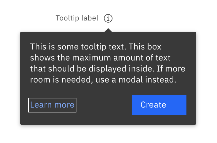
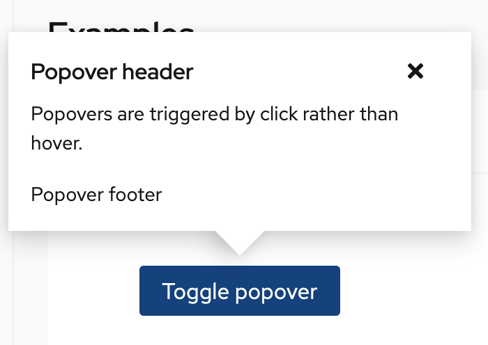
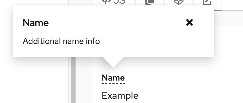
- Their Tooltip is essentially our popover, but always triggered with a click and persistent. It can contain actionable elements but regardless is a click-triggered, persistent element. I think this would work well as our new popover component pattern.
Product change: Some products are using tooltips for in-context help which trigger on hover. This would change those to popovers, and trigger on click.
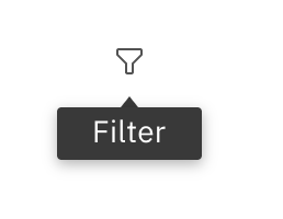
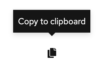
- Their Icon tooltip is what I've proposed our current tooltip to be scoped down to. Hover-triggered label of an icon action, which would be our new tooltip pattern.
Product change: None
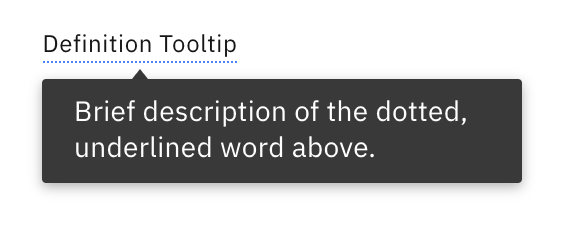
- Their Definition tooltip is our term definition on description list, triggered by hover. This would be an exception to the above rules, providing a term definition in a hover-triggered interaction using its own styling.
Product change: Likely none, but the examples on pf.org are showing a click interaction to trigger these, when they could be hover.
Conclusion
I think adopting these 3 main interactions (which we already have+utilize, just more spread out), should solve the above goal and questions resulting from it.
Tooltip - Always hover - Label for icon actions
Popover - Always click + persistent - In-context help or addl. info, can contain actionable elements like links or buttons
Definition tooltip - Always hover - In-context definition for terms, uses dotted underline on said terms
Metadata
Metadata
Assignees
Labels
Type
Projects
Status